![]()
Exploratory data analysis is an important and essential part of any data science project. It helps to prepare, process and visualize the data for better preliminary judgement. A high quality and comprehensive EDA eases the modeling and leads to a more reliable and conclusive outcomes.
This project is therefore focusing solely on EDA and utilizes various techniques to present the data and its related analysis. A set of SAT scores by state was used to practise various EDA techniques and attempt to use different plots to assist the understanding of the dataset and visualize them to gain insights and draw conclusions.
Package imports
import numpy as np
import pandas as pd
import csv
import seaborn as sns
import matplotlib.pyplot as plt
import scipy.stats as stats

plt.rcParams["patch.force_edgecolor"] = True
sns.set(style='darkgrid')
%matplotlib inline
%config InlineBackend.figure_format = 'retina'
Part 1 : Data Loading Using csv Module vs Using Pandas
1.1 Load the file with the csv module and put it in a Python dictionary
sat = './sat_scores.csv'
with open(sat,'rU') as f:

    content = [line for line in f]
    keys = content[0].replace('\n','').split(',')

    temp_values = content[1:]
    k1_values = []
    k2_values = []
    k3_values = []
    k4_values = []
    for v_temp in temp_values:
        v_temp = v_temp.replace('\n','').split(',')
        k1_values.append(v_temp[0])
        k2_values.append(v_temp[1])
        k3_values.append(v_temp[2])
        k4_values.append(v_temp[3])
sat_dict = dict(zip(keys, [k1_values,k2_values,k3_values,k4_values]))
print(sat_dict)
{'State': ['CT', 'NJ', 'MA', 'NY', 'NH', 'RI', 'PA', 'VT', 'ME', 'VA', 'DE', 'MD', 'NC', 'GA', 'IN', 'SC', 'DC', 'OR', 'FL', 'WA', 'TX', 'HI', 'AK', 'CA', 'AZ', 'NV', 'CO', 'OH', 'MT', 'WV', 'ID', 'TN', 'NM', 'IL', 'KY', 'WY', 'MI', 'MN', 'KS', 'AL', 'NE', 'OK', 'MO', 'LA', 'WI', 'AR', 'UT', 'IA', 'SD', 'ND', 'MS', 'All'], 'Rate': ['82', '81', '79', '77', '72', '71', '71', '69', '69', '68', '67', '65', '65', '63', '60', '57', '56', '55', '54', '53', '53', '52', '51', '51', '34', '33', '31', '26', '23', '18', '17', '13', '13', '12', '12', '11', '11', '9', '9', '9', '8', '8', '8', '7', '6', '6', '5', '5', '4', '4', '4', '45'], 'Verbal': ['509', '499', '511', '495', '520', '501', '500', '511', '506', '510', '501', '508', '493', '491', '499', '486', '482', '526', '498', '527', '493', '485', '514', '498', '523', '509', '539', '534', '539', '527', '543', '562', '551', '576', '550', '547', '561', '580', '577', '559', '562', '567', '577', '564', '584', '562', '575', '593', '577', '592', '566', '506'], 'Math': ['510', '513', '515', '505', '516', '499', '499', '506', '500', '501', '499', '510', '499', '489', '501', '488', '474', '526', '499', '527', '499', '515', '510', '517', '525', '515', '542', '439', '539', '512', '542', '553', '542', '589', '550', '545', '572', '589', '580', '554', '568', '561', '577', '562', '596', '550', '570', '603', '582', '599', '551', '514']}
1.2 Make a pandas DataFrame object with the SAT dictionary, and another with the pandas .read_csv() function
# set up dataframe with raw data from dict derived earlier

df_sat_dict = pd.DataFrame(sat_dict)
df_sat_dict.head()
| State | Rate | Verbal | Math | |
|---|---|---|---|---|
| 0 | CT | 82 | 509 | 510 |
| 1 | NJ | 81 | 499 | 513 |
| 2 | MA | 79 | 511 | 515 |
| 3 | NY | 77 | 495 | 505 |
| 4 | NH | 72 | 520 | 516 |
df_sat_dict.tail()
| State | Rate | Verbal | Math | |
|---|---|---|---|---|
| 47 | IA | 5 | 593 | 603 |
| 48 | SD | 4 | 577 | 582 |
| 49 | ND | 4 | 592 | 599 |
| 50 | MS | 4 | 566 | 551 |
| 51 | All | 45 | 506 | 514 |
Last row is the sum of all rows above, need to remove this from analysis to avoid data being skewed
df_sat_dict.drop(index=51, inplace=True)
df_sat_dict.tail()
| State | Rate | Verbal | Math | |
|---|---|---|---|---|
| 46 | UT | 5 | 575 | 570 |
| 47 | IA | 5 | 593 | 603 |
| 48 | SD | 4 | 577 | 582 |
| 49 | ND | 4 | 592 | 599 |
| 50 | MS | 4 | 566 | 551 |
df_sat_dict.dtypes
State     object
Rate      object
Verbal    object
Math      object
dtype: object
Data type for all variables above were found as object types (including those that supposed to be numeric)
# set up dataframe with raw data loaded directly using read_csv()

df_sat = pd.read_csv(sat)
df_sat.head()
| State | Rate | Verbal | Math | |
|---|---|---|---|---|
| 0 | CT | 82 | 509 | 510 |
| 1 | NJ | 81 | 499 | 513 |
| 2 | MA | 79 | 511 | 515 |
| 3 | NY | 77 | 495 | 505 |
| 4 | NH | 72 | 520 | 516 |
df_sat.tail()
| State | Rate | Verbal | Math | |
|---|---|---|---|---|
| 47 | IA | 5 | 593 | 603 |
| 48 | SD | 4 | 577 | 582 |
| 49 | ND | 4 | 592 | 599 |
| 50 | MS | 4 | 566 | 551 |
| 51 | All | 45 | 506 | 514 |
df_sat.drop(index=51, axis=0, inplace=True)
df_sat.tail()
| State | Rate | Verbal | Math | |
|---|---|---|---|---|
| 46 | UT | 5 | 575 | 570 |
| 47 | IA | 5 | 593 | 603 |
| 48 | SD | 4 | 577 | 582 |
| 49 | ND | 4 | 592 | 599 |
| 50 | MS | 4 | 566 | 551 |
df_sat.dtypes
# numbers were found transformed as integer data type right away when using read_csv()
State     object
Rate       int64
Verbal     int64
Math       int64
dtype: object
Observation on the difference :
- If we do not convert the string column values to float in dictionary, the columns in the DataFrame are of type
object. But when using read_csv(), the data type is framed up correctly without additional adjustment. Using read_csv() will be a better and faster option.
Part 2 : Create a “Data Dictionary”
A data dictionary is an object that describes the data. It helps users to understand the data better and thus ease the EDA process. The data dictionary in this exercise is framed up to include the name of each variable (column), the type of the variable, description of what the variable is, and the shape (rows and columns) of the entire dataset.
data_dict = pd.DataFrame(columns=['Column_name', 'Data_type', 'Description', 'No_of_records'])
data_dict['Column_name'] = df_sat.columns
data_dict['Data_type'] = list(df_sat.dtypes)
data_dict['Description'] = ['US State of SAT scores', 'Rate of students that take the SAT in that state', 'Mean verbal score in that state', 'Mean math score in that state']
df_sat.info() # since all columns are with same no. of records, can use .shape[0] to get this info
<class 'pandas.core.frame.DataFrame'>
Int64Index: 51 entries, 0 to 50
Data columns (total 4 columns):
State     51 non-null object
Rate      51 non-null int64
Verbal    51 non-null int64
Math      51 non-null int64
dtypes: int64(3), object(1)
memory usage: 2.0+ KB
data_dict['No_of_records'] = [df_sat.shape[0] for v in data_dict['Column_name']]
data_dict
| Column_name | Data_type | Description | No_of_records | |
|---|---|---|---|---|
| 0 | State | object | US State of SAT scores | 51 |
| 1 | Rate | int64 | Rate of students that take the SAT in that state | 51 |
| 2 | Verbal | int64 | Mean verbal score in that state | 51 |
| 3 | Math | int64 | Mean math score in that state | 51 |
Part 3 : Data Analysis and Visualization
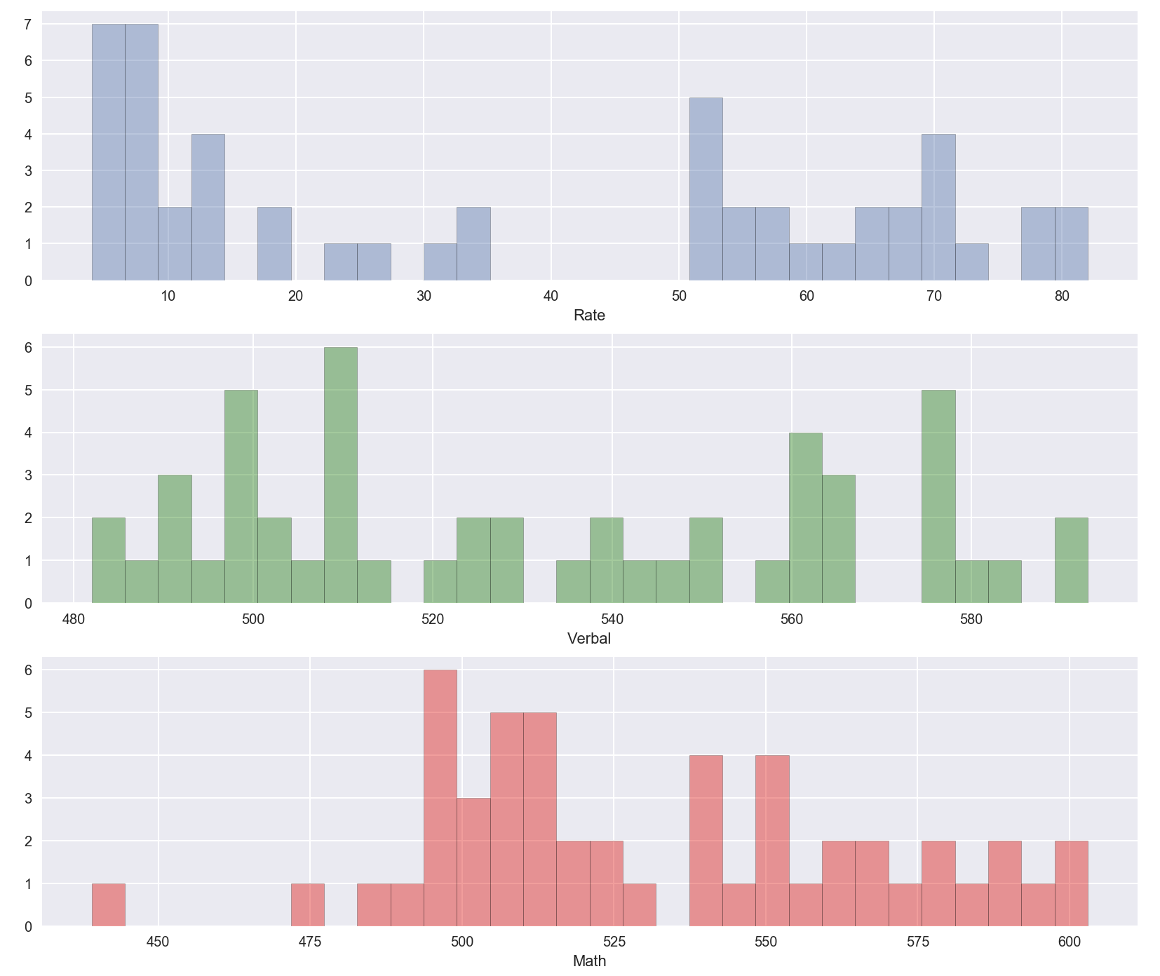
3.1 Check the distribution of numerical columns
Data was examined to see if it was normally distributed
fig, ax = plt.subplots(3,1, figsize=(14,12))
sns.distplot(df_sat['Rate'], bins=30, kde=False, ax=ax[0])
sns.distplot(df_sat['Verbal'], bins=30, kde=False, color='g', ax=ax[1])
sns.distplot(df_sat['Math'], bins=30, kde=False, color='r', ax=ax[2])
3.2 Get an overview of the correlation of each variable in the dataset
sns.pairplot(df_sat, hue='State', size=3, aspect=1)
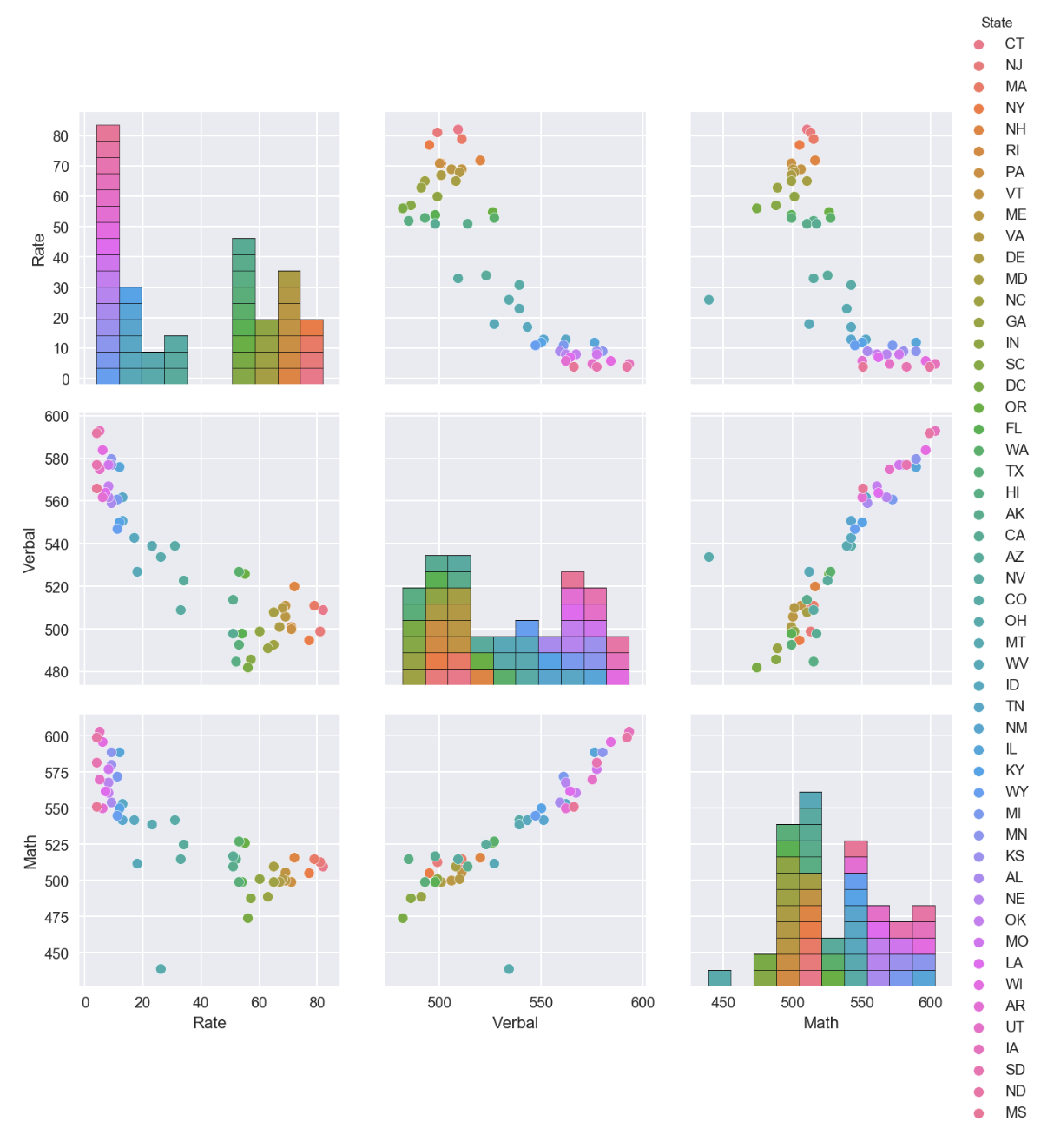
Observation on Pairplot :
- Rate data is least normalized as compared to Verbal and Math data
- Positive correlation observed for Math and Verbal
- Negative correlation observed for Math & Rate, Verbal & Rate
- SAT performance varied for various states
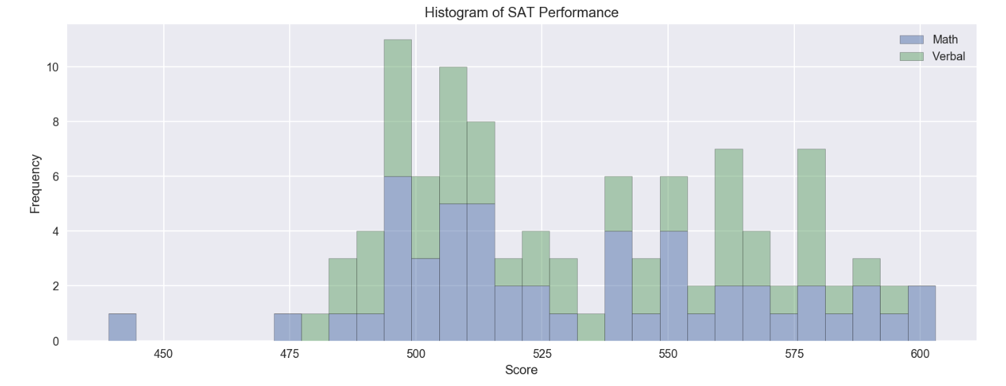
3.3 : Comparison of Math and Verbal Scores
df_sat[['Math', 'Verbal']].plot.hist(bins=30, alpha=0.5, stacked=True, figsize=(14,5))
plt.title('Histogram of SAT Performance')
plt.xlabel('Score')
fig, ax = plt.subplots(2,3, figsize=(25,6))

sns.boxplot(data=df_sat['Rate'],orient='h', ax=ax[0][0])
sns.distplot(df_sat['Rate'], ax=ax[1][0],bins=30)

sns.boxplot(data=df_sat['Verbal'], orient='h', ax=ax[0][1], color='orange')
sns.distplot(df_sat['Verbal'], bins=30, ax=ax[1][1], color='orange')

sns.boxplot(data=df_sat['Math'], orient='h', ax=ax[0][2], color='purple')
sns.distplot(df_sat['Math'], bins=30, ax=ax[1][2], color='purple')
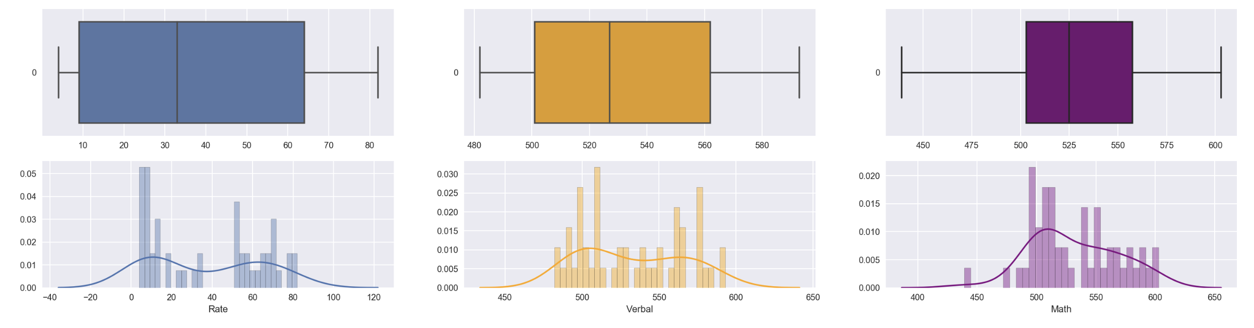
Observation :
- Though SAT dataset doesn’t very well distributed, there’s no outlier point observed for all the 3 keys numerical variables
- Outlier is defined as data points that are beyond 1.5 of interquartile range :
- 1.5 below the 1st quartile
- 1.5 above the 3rd quartile
fig = plt.figure(figsize=(14,5))
ax = fig.gca()

ax = sns.boxplot(data=df_sat[['Rate','Verbal','Math']], orient='h', palette='Set2')
ax = plt.xlabel('Score')
ax = plt.title('Boxplot of SAT Performance')
ax = plt.text(1,1,"Shouldn't plot Rate together as it has different score scale", fontsize=14)
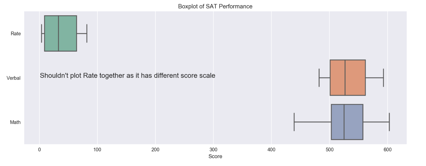
Benefits of using boxplot vs scatterplot/histogram:
- good way to summarize large amounts of data
- provide information about the range and distribution of data set inclusive details such as :
- minimum
- 1st quartile
- median
- 3rd quartile
- maximum
- outliers
- give some indication of the data’s symetry and skewness
However, for boxploat above, Rate doesn’t have the same scale as Verbal and Math, plotting the raw data of Rate within one chart with others makes the comparison not so relevant. To have the comparision more relevant, the data needs to be standardize on the same scale. It can be done through the standardization method below by factoring in the mean and standard deviation.
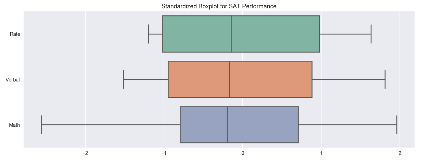
# standardize variables

df_sat_std = (df_sat[['Rate','Verbal','Math']] - df_sat.mean()) / df_sat.std()
fig = plt.figure(figsize=(14,5))
ax = fig.gca()

ax = sns.boxplot(data=df_sat_std, orient='h', palette='Set2')
ax = plt.title('Standardized Boxplot for SAT Performance')
3.4 : Analysis on Subset of Data
3.4.a) States with Verbal scores greater than average Verbal scores across states
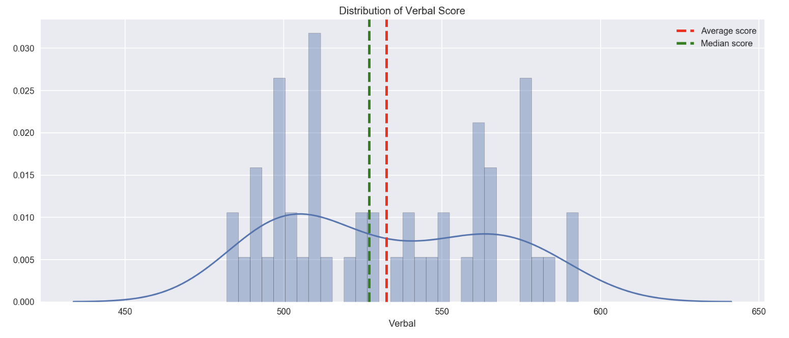
df_sat['Verbal'].mean()
532.5294117647059
df_sat_verbal_abv_average = df_sat[df_sat['Verbal']>df_sat['Verbal'].mean()].sort_values(by='Verbal', ascending=False)
df_sat_verbal_abv_average
| State | Rate | Verbal | Math | |
|---|---|---|---|---|
| 47 | IA | 5 | 593 | 603 |
| 49 | ND | 4 | 592 | 599 |
| 44 | WI | 6 | 584 | 596 |
| 37 | MN | 9 | 580 | 589 |
| 48 | SD | 4 | 577 | 582 |
| 38 | KS | 9 | 577 | 580 |
| 42 | MO | 8 | 577 | 577 |
| 33 | IL | 12 | 576 | 589 |
| 46 | UT | 5 | 575 | 570 |
| 41 | OK | 8 | 567 | 561 |
| 50 | MS | 4 | 566 | 551 |
| 43 | LA | 7 | 564 | 562 |
| 31 | TN | 13 | 562 | 553 |
| 45 | AR | 6 | 562 | 550 |
| 40 | NE | 8 | 562 | 568 |
| 36 | MI | 11 | 561 | 572 |
| 39 | AL | 9 | 559 | 554 |
| 32 | NM | 13 | 551 | 542 |
| 34 | KY | 12 | 550 | 550 |
| 35 | WY | 11 | 547 | 545 |
| 30 | ID | 17 | 543 | 542 |
| 28 | MT | 23 | 539 | 539 |
| 26 | CO | 31 | 539 | 542 |
| 27 | OH | 26 | 534 | 439 |
round(len(df_sat_verbal_abv_average) / df_sat['State'].nunique()*100,2)
47.06
- 47.06% of states in US having Verbal score above average.
- Less than half of the states in US achieving average score
3.4.b) States with Verbal scores greater than median Verbal scores across states
df_sat['Verbal'].median()
527.0
df_sat_verbal_abv_median = df_sat[df_sat['Verbal']>df_sat['Verbal'].median()].sort_values(by='Verbal', ascending=False)
df_sat_verbal_abv_median
| State | Rate | Verbal | Math | |
|---|---|---|---|---|
| 47 | IA | 5 | 593 | 603 |
| 49 | ND | 4 | 592 | 599 |
| 44 | WI | 6 | 584 | 596 |
| 37 | MN | 9 | 580 | 589 |
| 48 | SD | 4 | 577 | 582 |
| 38 | KS | 9 | 577 | 580 |
| 42 | MO | 8 | 577 | 577 |
| 33 | IL | 12 | 576 | 589 |
| 46 | UT | 5 | 575 | 570 |
| 41 | OK | 8 | 567 | 561 |
| 50 | MS | 4 | 566 | 551 |
| 43 | LA | 7 | 564 | 562 |
| 31 | TN | 13 | 562 | 553 |
| 45 | AR | 6 | 562 | 550 |
| 40 | NE | 8 | 562 | 568 |
| 36 | MI | 11 | 561 | 572 |
| 39 | AL | 9 | 559 | 554 |
| 32 | NM | 13 | 551 | 542 |
| 34 | KY | 12 | 550 | 550 |
| 35 | WY | 11 | 547 | 545 |
| 30 | ID | 17 | 543 | 542 |
| 28 | MT | 23 | 539 | 539 |
| 26 | CO | 31 | 539 | 542 |
| 27 | OH | 26 | 534 | 439 |
round(len(df_sat_verbal_abv_median)/df_sat['Verbal'].nunique()*100,2)
61.54
- 61.54% of states in US having Verbal score above the median score
- This percentage is slightly higher ( = more states included ) because the median score is slightly lower than the average score
# visualize the difference of mean, median and distribution of Verval score

plt.figure(figsize=(15,6))
sns.distplot(df_sat['Verbal'], bins=30)
plt.axvline(x=df_sat['Verbal'].mean(), linewidth=2.5, linestyle='dashed', color='r', label='Average score')
plt.axvline(x=df_sat['Verbal'].median(), linewidth=2.5, linestyle='dashed', color='g', label='Median score')
plt.legend()
plt.title('Distribution of Verbal Score')
3.4.c) Difference between the Verbal and Math scores
# set up new column to reflect the difference of Verbal vs Math score

df_sat['Difference_Verbal_Math'] = df_sat['Verbal'] - df_sat['Math']
df_sat.head()
| State | Rate | Verbal | Math | Difference_Verbal_Math | |
|---|---|---|---|---|---|
| 0 | CT | 82 | 509 | 510 | -1 |
| 1 | NJ | 81 | 499 | 513 | -14 |
| 2 | MA | 79 | 511 | 515 | -4 |
| 3 | NY | 77 | 495 | 505 | -10 |
| 4 | NH | 72 | 520 | 516 | 4 |
# Top 3 states with greatest difference between Verbal and Math

df_sat_verbal_greaterThanMath = df_sat.sort_values(by='Difference_Verbal_Math', ascending=False).head(10)
df_sat_verbal_greaterThanMath.head(3)
| State | Rate | Verbal | Math | Difference_Verbal_Math | |
|---|---|---|---|---|---|
| 27 | OH | 26 | 534 | 439 | 95 |
| 50 | MS | 4 | 566 | 551 | 15 |
| 29 | WV | 18 | 527 | 512 | 15 |
# Top 3 states with greatest difference between Math and Verbal

df_sat_math_greaterThanVerbal = df_sat.sort_values(by='Difference_Verbal_Math', ascending=True).head(10)
df_sat_math_greaterThanVerbal.head(3)
| State | Rate | Verbal | Math | Difference_Verbal_Math | |
|---|---|---|---|---|---|
| 21 | HI | 52 | 485 | 515 | -30 |
| 23 | CA | 51 | 498 | 517 | -19 |
| 1 | NJ | 81 | 499 | 513 | -14 |
3.5. Examine Summary Statistics
Summary stats enables a quick overall on the data, checking for correlation, missing values and anomalies
df_sat.drop(columns=['Difference_Verbal_Math']).describe(include='all')
| State | Rate | Verbal | Math | |
|---|---|---|---|---|
| count | 51 | 51.000000 | 51.000000 | 51.000000 |
| unique | 51 | NaN | NaN | NaN |
| top | UT | NaN | NaN | NaN |
| freq | 1 | NaN | NaN | NaN |
| mean | NaN | 37.000000 | 532.529412 | 531.843137 |
| std | NaN | 27.550681 | 33.360667 | 36.287393 |
| min | NaN | 4.000000 | 482.000000 | 439.000000 |
| 25% | NaN | 9.000000 | 501.000000 | 503.000000 |
| 50% | NaN | 33.000000 | 527.000000 | 525.000000 |
| 75% | NaN | 64.000000 | 562.000000 | 557.500000 |
| max | NaN | 82.000000 | 593.000000 | 603.000000 |
Count => no. of records/population size
mean => average of the total population
std => standard deviation of the population
min => lowest value of the record
25% => value by 25% quartile of the population
50% => value by 50% quartile of the population
75% => value by 75% quartile of the population
max => highest value of the record
3.5 a) Correlation with Pearson Coefficient
# check correlation of numerical variables in dataset

df_sat_corr = df_sat.drop(columns=['State','Difference_Verbal_Math']).corr()
df_sat_corr
| Rate | Verbal | Math | |
|---|---|---|---|
| Rate | 1.000000 | -0.888121 | -0.773419 |
| Verbal | -0.888121 | 1.000000 | 0.899909 |
| Math | -0.773419 | 0.899909 | 1.000000 |
plt.figure(figsize=(10,6))
sns.heatmap(df_sat_corr)
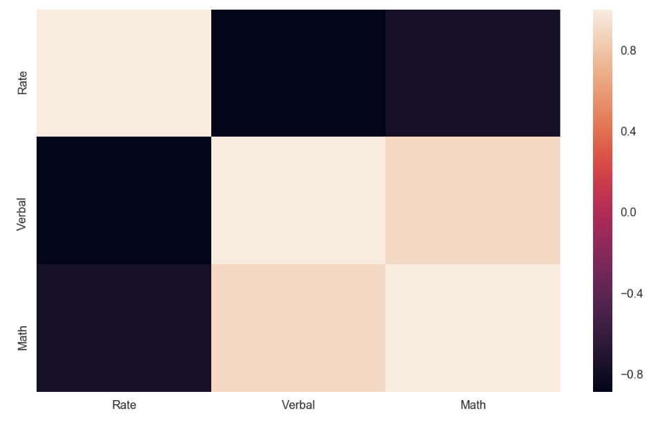
Observations:
- Verbal and Math is positively correlated => If doing good in Verbal, also likely doing good in Math
- Rate is negatively correlated to Verbal and Math => State with low SAT taking rate seems to get better score in Verbal / Math
3.5 b) Correlation with Spearman Coefficient
df_sat_spearman = df_sat.drop('Difference_Verbal_Math', axis=1).corr(method='spearman')
df_sat_spearman
| Rate | Verbal | Math | |
|---|---|---|---|
| Rate | 1.000000 | -0.836058 | -0.811662 |
| Verbal | -0.836058 | 1.000000 | 0.909413 |
| Math | -0.811662 | 0.909413 | 1.000000 |
Observations
- spearman correlation coefficient was found higher than the pearson correlation coeffifient
Process calculating the spearman rank correlation
- Rank the values of each variable, with the largest value having rank 1.
- Calculate the difference in ranks
- Complete the rest of the calculation with the formula below: \(r = 1 - \frac {6 \sum d_i^2} {n^3 - n}\)
where $d_i$ is the differences in paired ranks, $n$ is the number of rows
Useful Notes :
- The Spearman Rank correlation measures the rank of one variable against another.
- A strong positive spearman rank correlation means that if one does well in math one will most likely also do well in verbal test.
- A strong negative spearkman rank means that if one does well in one, one would most likely do poorly in the other.
- The Spearman Rank correlation is not as sensitive to outliers because it does not take into account how far away the outliers are from the average.
- It is only concerned about the order of those outliers versus everyone else.
- Outliers in this dataset were those states that did well in one subject but poorly in the other (the two biggest difference). But since these are ranked aka sorted according to how their scores are; doing very well in Math and then doing average in Verbal test will only result is a high rank difference which will then give us a negative spearman rank correlation (not zero linear pearson correlation).
3.5 c) Covariance
# check covariance of the dataset

df_sat_cov = df_sat.drop(columns=['Difference_Verbal_Math']).cov()
df_sat_cov
| Rate | Verbal | Math | |
|---|---|---|---|
| Rate | 759.04 | -816.280000 | -773.220000 |
| Verbal | -816.28 | 1112.934118 | 1089.404706 |
| Math | -773.22 | 1089.404706 | 1316.774902 |
Difference between covariance matrix and correlation matrix.
- Covariance matrix is a measure of how related the variables are to each other, but it is measured on the variance of the variables.
- While correlation matrix is dimensionless, regardless of what the units are in the variables, it always return the same in between -1 and 1
Process to convert the covariance into the correlation
- Conversion can be done using the following formula: \(corr(X, Y) = \frac{cov(X, Y)}{std(X)std(Y)}\)
Reason correlation matrix is preferred over covariance matrix for examining relationships in data
- Covariance is difficult to compared due to different dimension used whilst correlation is a scaled & standardized version of covariance in which the values are assured to be -1 and 1
3.5 d) Percentile Scoring
Examine percentile scoring of data. In other words, the conversion of numeric data to their equivalent percentile scores.
df_sat_percentile = df_sat.copy()
df_sat_percentile['Rate_percentile'] = df_sat_percentile['Rate'].apply(lambda x: stats.percentileofscore(df_sat_percentile['Rate'],x))
df_sat_percentile.head()
| State | Rate | Verbal | Math | Difference_Verbal_Math | Rate_percentile | |
|---|---|---|---|---|---|---|
| 0 | CT | 82 | 509 | 510 | -1 | 100.000000 |
| 1 | NJ | 81 | 499 | 513 | -14 | 98.039216 |
| 2 | MA | 79 | 511 | 515 | -4 | 96.078431 |
| 3 | NY | 77 | 495 | 505 | -10 | 94.117647 |
| 4 | NH | 72 | 520 | 516 | 4 | 92.156863 |
- We could also possibly rank the values in each variable by percentile when calculating using spearman method
- Percentile scoring and the spearman rank correlation are related in the sense that they both take a value that is calculated by how they are ranked in relation to one another in some sorted order, and not based on the difference from the mean.
- Percentile scoring ranks each value against a sorted order to find in which percentile do the value fall in. For example, take New York state. A 94.12 percentile score means that the state’s participantion rate of 77 is in the top 94.12% of the entire dataset. That there were 3 other states that had a higher participation rate than it ( (100% - 94.12%) x 52 = approx. 3 ).
3.5 e) Percentiles vs outliers
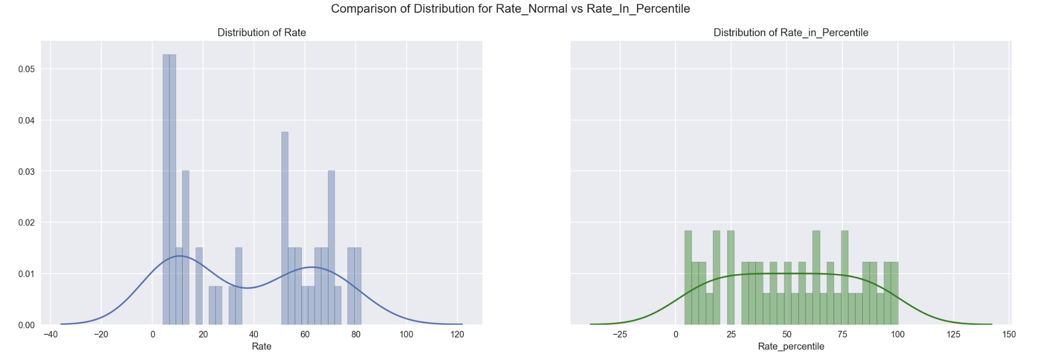
# 9.3.2 Distribution as per normal values

fig, ax = plt.subplots(1,2, sharey = True, figsize=(20,6))

sns.distplot(df_sat_percentile['Rate'], bins=30, ax=ax[0]) # Distribution as per normal values
ax[0].set_title('Distribution of Rate')
sns.distplot(df_sat_percentile['Rate_percentile'], bins=30, ax=ax[1], color='g')
ax[1].set_title('Distribution of Rate_in_Percentile')

plt.suptitle('Comparison of Distribution for Rate_Normal vs Rate_In_Percentile', size=14)
plt.show()
fig, ax = plt.subplots(2,1, figsize=(10,8))

sns.boxplot(data=df_sat_percentile[['Rate', 'Rate_percentile']], ax=ax[0])
sns.violinplot(data=df_sat_percentile[['Rate', 'Rate_percentile']], ax=ax[1])
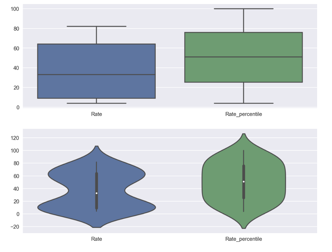
Observations :
- Percentile is not as sensitive to outliers because it does not take into account how far away the outliers are from the average.
- Rate was observed more normally distributed using percentile
Key Learnings
There are various ways and techniques that we can use to analyze data. From loading data, data preparation, data analysis and data visualization, there are many options that we can use to achieve the similar purpose. Different techniques have their own strength in particular features and performance. Therefore, it is essential to evaluate which one serves the best in term of clarity and provides the best visualization that enables a better and simplified explanation to a complex observation.
Sometimes, we can combine multiple approaches / different plots to complement the unique feature that demonstrates by one type of chart but not the other. Through this combination, it can help us to explain, to ‘re-imagine’ and understand the dataset better, and assist us to discover patterns in different perspective to make our analysis more comprehensive.